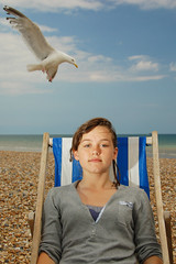
At this point, I have to look hard to find reasons to knock photos out. I just dropped two photos for no other reason than they are not really headshots. But they were both so beautiful I wanted to stick them up on the site and show them off -- and help me procrastinate a little longer in picking a winner.
One of them would look right at home in the NYT Sunday Mag, the other is an art photo mag cover waiting to happen.
Too loose to win, too good to throw away -- after the jump.
__________
Beautiful Look in Horrible Light
 Jerome Love's photo of "Thulani," a youth program director in Soweto, South Africa is a wonderful example of how bad midday light can be finessed with small flashes. (Click the pic for bigger.)
If you look at the area in the right of the frame, you can see what ambient Jerome was dealing with. So he worked the shadow side of a building to build his light in the shade. He cheated the building a little to use the sun as a rim. This added a nice layer of texture to the portrait.
He used two bare SB-28s. The lack of a mod helps in the light output department. The key was high camera right, at 1/4 power, zoomed to 85mm throw. The fill was on the ground in front (on the vertical lens axis) and was set to 1/8.
Note that the key was upper camera right -- same side as the rim. This little departure from convention always adds a different feel to a lit portrait.
Bad ambient light: Free.
Two SB-28s: About $200.00.
Owning midday with two small flashes: Priceless.
I Can't Stop Looking at This One
 Toni.R's timeless portrait of her 14-year-old daughter works even before the addition of the seagull, which is posed so perfectly it looks like a suspended movie prop.
The lighting is simple -- a bare SB-26, dialed way down, from camera left. It is working against the sun, which comes from camera right. (Check out the gull for ambient-only light.) Toni's light modifier -- a Tupperware bowl -- was rendered inoperative when it was accidently mistaken for the coleslaw dish.
I'll bet that never happens to Annie.
__________
These both had beautiful light, interesting composition and an atypical look. But beyond that there was a strong connection between the subject and the viewer in each portrait.
While both of these photos were technically not headshots, they get the highest compliment I can give a photo -- that I really wish I had taken them.
Không có nhận xét nào:
Đăng nhận xét