Kidding.
They are great. But I did go through them a lot.
A few standouts, some notes and a lucky winner -- inside.
__________
First of all, it was neat to see so many people go to the effort to talk someone into letting you photograph them. I know this was not easy for many of you, and I hope it ended up being a growth experience. It was also great to see so many of your faces, and I will admit to that being an ulterior motive of the second portion of the assignment.
Second, I was impressed with the sheer number of photos that would have looked right at home in A-list magazines -- including more than a few potential covers. Bearing in mind that most of the readers of this site are amateurs, that rocks.
Now the hard part -- picking a winner. It is, of course, subjective. And any of at least a hundred photos in the stack could just as easily been featured here today. I had time to leave some notes on a few pictures -- although not much, as we are both finishing up moving and closing on the old house this week. (Kinda crazy around here.)
That said, I pulled up some entries to talk about and use as examples. I hope you will indulge how personal (and, thus, seemingly arbitrary) picture editing can be. The important thing is that so many of you jumped right into the deep end.
And, hopefully, benefitted from the experience.
Some of the photos below are dual-pic composites, others have the photographer's headshot in a nearby frame in their Flickr stream.
As always, click on the pic to see it bigger and see who shot it. And please take a moment to leave a note under your fave.
Enough yapping. On with the photos, and the reasons they stood out to me.
__________
 Because looked like it jumped off of the pages of WIRED Magazine.
 Because of the DIY biz-card gobo on the key.
Because of the in-focus background that could have been a weird distraction, but instead carried the shadows from the low-fill in a cool way.
Because the photog shot his recently unemployed dad, which probably injected a fun, purposeful shooting session / family activity into a stressful period.
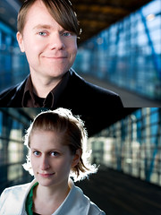 Because of the impish expression on the subject's (top) face.
 Because of the use of graphic lines and color.
Because of the inclusion of background context while still keeping a headshot framing. The photo has layers of of interest.
Because of the confidence exuded by the subject -- he looks like he is ready to take on the world.
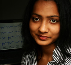 Because of the inclusion of vocation-specific background, but not in a way that hammers you over the head.
Because the lighting is simple, elegant and does not call attention to itself.
Because the subject exudes professionalism and warmth -- her expression makes her look like someone you would want to work with.
Because the composition -- including contextual background -- is still tight enough to work as a Facebook and/or LinkedIn avatar and still be readable. The photo can be used in a variety of ways.
 Because of the strong graphic quality.
Because of the quirky expression.
Because of the creative use of a light modifier as a quickie background.
Because of how the high-key, airy exposure brings the whole picture together.
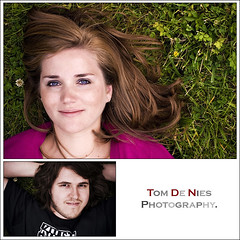 Because he placed the subject on a background that many people miss as they are walking around on their background looking for a background.
Because of the way the expression, hair, grass and everything work together.
Because of the composition that makes the flower in the ground look as if it is in her hair.
Because the shooting angle allowed the photog to use an umbrella as key and the cloudy, overhead fill as a huge, on-axis softbox.
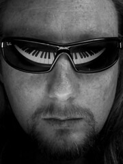 Because of the intensity.
Because of the tight crop, which adds to the above.
Because of the keyboard reflection being pulled off very well in the curved glasses. Not novel, but done very well.
Because of how the B&W conversion added to the simplicity of the photo.
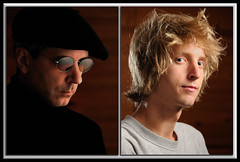 Because the subject (left) oozes cool.
Because of how well the specular highlights were handled with the glasses.
Because of the color palette and tonal range. The internal separation is great -- the face works perfectly against the background.
Because how many sons can pull off a photo of their dad that "oozes cool" on Father's Day?
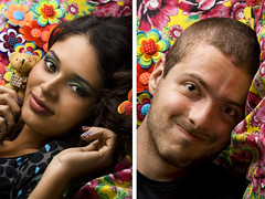 Because of the expression and connection in the subject (left).
Because of the lighting.
Because the background, which at first seemed too busy, is actually composed of the DIY crafts the subject makes.
Because of the diagonal crop to the headshot.
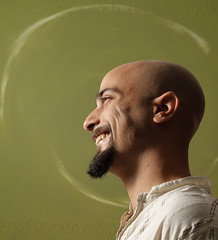 Because of the well-executed profile lighting. (Lighting from a little behind the subject, as here, is a better bet than straight-on profile light.)
Because of the expression and moment.
Because of the photographer seeing the design on the background and using it to add a dynamic element in what could have been a static photo.
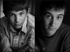 Because of the composition of the subject (left) and how well it works with the lighting.
Because of the distillation of the photo that happens with the conversion to B&W.
Because of the connection between the subject and the viewer -- and how well the two brothers' photos go together. Probably not a bad thing to pull together a few days before Father's Day.
Because most brothers I knew at this age could not stop beating each other up long enough to pull of two photos like this.
__________
So, there are a few sweet examples in a huge field of entries, many of which could have just as easily been on this page.
To see a slideshow of all of the entries, settle into a very comfortable chair, grab some caffeine and click here.
Oh, yeah -- and to see which one of these photographers has won the Speedlight Pro Kit, the Strobist Lighting DVDs and the Trade Secret Cards for the first assignment from SBCII: Click here.
Không có nhận xét nào:
Đăng nhận xét