Bad idea.
Be that as it may, a smorgasbord of finalists -- and one winner -- inside.
__________
Over. Eight. Hundred. Entries.
This time around, I streamlined the process to make things a little easier. First I threw out all of the vegetarian crap just to narrow things down quickly. Then I let Flickr choose by sorting the remaining pictures by "interestingness." Piece of cake!
(Kidding.)
Many rounds of winnowing were needed to get to this final ten. And on any given day, a completely different set of ten could have been chosen by someone else. But "someone else" wasn't here, so you were stuck with me.
FWIW, I got it down to a couple dozen photos -- all of which I loved -- and at that point invited some neighborhood cooks to help me choose the ten finalists. Thus, the following photos pass both the photo and food enthusiast tests.
Herewith, your finalists.
In No Particular Order
 Because I have seen about a gazillion pictures of Coca Cola, and I have never seen this.
Because he kept looking until he saw a unique detail and lit it beautifully. (I'd throw some tracing paper in as a second diffuser to lose the umbrella ribs, tho.)
I would also note that Hipporage is now two-for-two in the finals. Kickass.
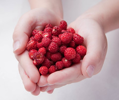 Because it is simple and beautiful.
Because it tells a story. (Click thru to see why he came up with this and how he submitted it.)
Because the lighting works without calling attention to itself. That is an admirable quality, and one at which I often fail.
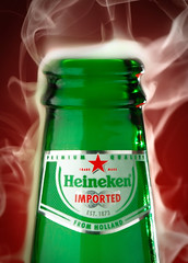 Because while the photo is undeniably cool, it also presents the opportunity to use the phrase, "heiney smoke" in print, with absolute impunity.
 And how often does one get to do that?
(Answer: Once.)
There you go, Ben. Mark that phrase off of the list.
A little aside: Legend has it there was an ongoing challenge between many of the reporters at The Baltimore Sun -- with real money involved -- to sneak the phrase "creamy white thighs" into a story in print.
Reporter Joel McCord is said to have come closest, in describing a painting over the bar at a joint on Maryland's Eastern Shore. Copydesk, also apparently aware of the bet, cut it at the last minute.
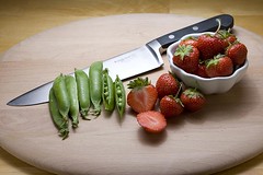 Because of the way the light works for the berries, the veggies and the knife.
Because of the way the knife ties it all together.
Because the photog used the assignment to give a shout-out to a very cool CSA. (I'd be all over that if I was in Massachusetts.)
NOTE: That CSA would be a great, long-term photo project for this photographer. I am betting there would be good food in it for you, too.
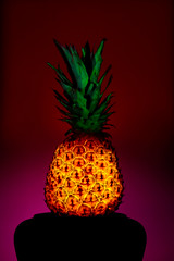 Because, well, holy-crap-it's-a-glowing-pineapple, fer Pete's sake!
 I have never, ever seen that before. A melon, sure. But a pineapple? That had to be full manual on the 383 he has stuck in there. It looks awesome.
And the cross-gridded leaves up top rock, too. Little obvious on the dodge. But still, that backlit pineapple...
I dunno why, but it kinda reminds me of "the lamp" from A Christmas Story.
And I want a lamp like this. Seriously.
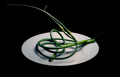 Because this looks like it could be a sculpture at MOMA.
Because the lighting is at once minimalist and three-dimensional.
Because of the way the garlic stands out as the only color in the frame. Beautiful.
 Because of the layers of different textures -- especially the patina on the skillet.
Because it is old, evocative and suggests a story.
Because of the compositional air in the peppers. It would have been easy to put too much stuff in this one.
Note: I also liked this tilapia photo, which had a similar physical theme. They were too similar to both be finalists, and it was pretty close.
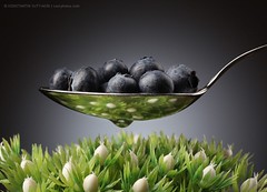 Because of the light and composition.
Because the reflection in the spoon is so cool it almost looks computer generated.
Because of the competing textures, all beautifully lit.
(You may remember Konstantin from this feature.)
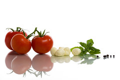 Because of the perfectly executed theme.
Because of the way the ingredients were selected, composed and lit.
Because Missus Strobist lobbied hard for this one. (But she was pining for a little dribble of olive oil in there ...)
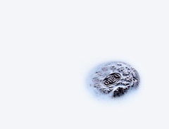 Because I do not ever think I have seen an Oreo photographed as appetizingly as this one.
Because of the negative space.
Because of the perfect control of tones.
Because of the way the logo is barely holding off the encroaching milk. There's actually kind of a moment in there ...
Let's Wrap This Up -- I'm Getting Hungry.
I'll get to the winner in a minute. But one non-finalist deserves mention for being so over-the-top, blatant Captain Obvious suck-up that it almost worked.
Almost.
He even had a time-lapse video of the shoot.
Paul Morton was among those who thought a Diet Mountain Dew shot was the fast track to Orbis City. (Nice try, bucko. But I was expecting that, so the resistance was strong.)
The video did crack me up tho, in its over-the-top-ness:
I am just glad no one knew my real weakness when it comes to food. It was formed back in the late 1960's by my grandmother, Thelma Hobby, in her small kitchen in Mulberry, Florida.
That would have been hard to resist.
So, In the Absence of Dumplings
The winner of the Orbis Ring Flash Adapter, the Lighting DVDs, and the Trade Secret Strobist Cards is here.
Không có nhận xét nào:
Đăng nhận xét