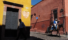
 Last week I was in San Miguel de Allende, which sits at over 6,000 feet of elevation in the central Mexican highlands.
 (Town motto: Meh, oxygen is overrated…)
There for a Santa Fe Workshops lighting gig with Rosi, Beth, Françoise, Sara and two Peters, we threw ourselves into a week-long intensive on small flashes, eating well and (me) mostly being out of breath.
They worked their butts off, and went from lighting each other very tentatively in the beginning to working completely on their own by the end of the week. Start the week strong, and finish it soaking up rays in the courtyard while they do all of the heavy lifting -- works for me.
Coupla cool lighting examples with setups -- and some good food -- inside.
__________
Drinking From the Fire Hose
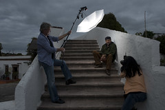 We started on Monday with a full day of rapid-fire info and lighting demos. The object of the day is to leave all heads spinning (this is remedied by beer later in the evening) and to have them exposed to many new ideas.
 By the next morning they were shooting each other, and then moving on to photographing local residents by afternoon.
Into the Deep End
By Thursday, they were locked and loaded. Their assignment was to shoot a mock cover and inside lede (of a local resident) as if they had been hired to shoot for an out-of-town magazine that showcases emerging artists.
San Miguel, by the way, is ridiculously beautiful. And it should definitely be on your short list if you are visiting Mexico. In fact, Françoise Lemieux, one of the lighting students, runs a "B&K" there so you already have a friend of a friend in town should you decide to go.
It is called a B&K instead of a B&B because, while it has a kitchen, Françoise will not be cooking for you. But you are free to self-cater, which is not a bad deal for $33 a night…
To get a good idea of Françoise, picture Denise Richards -- but with way more attitude. We cracked on her all week about it, and she was never without a quick retort. She is also quite camera shy. Françoise' idea of a good photo is one without her in it. So naturally I will be including photos of her in this post.
She drew as her subject Taka, who is just your typical Japanese expat blues musician in Mexico running a Japanese restaurant which specializes in bento boxes. (See, I told you this was an interesting place.)
Taka Setup and Shoot
 The really cool thing about lighting is, of course, that it allows you to bend a scene at will to suit your whims. And if your will is as strong as that of Françoise, you can bend the hell out of it.
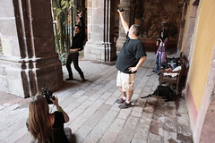
Case in point is this setup (by Peter Norby) of her inside lede shot, which features a compact model dee-lux voice-activated light stand. I say dee-lux because it comes pre-loaded with stabilization weights.
The natural light, as you can see, is kinda milquetoasty and coming in from camera left. But add light from camera right (one hard key light and an off-the-wall, softer fill) and you completely flip the lighting direction.
She saw the photo in her head, and rejected pretty much all of my suggestions right out of hand. Smart woman. I mean, who am I to tell her how to light something at this point? It was already Thursday fer cryin' out loud.
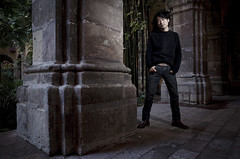 Her
Her She was no exception, either. Everyone in the class was working with their own ideas at that point. I was more than willing to help, of course. But they proceeded to brush off my ideas in favor of their own. The whole class absolutely nailed this assignment as far as I was concerned.
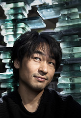 Moving to the cover photo, Françoise wanted to use the sun to backlight a glass-tile fountain as a light-textured backdrop for a headshot. The sun, of course, did not cooperate by the time she had Taka for a second shoot.
No worries there. Every single student was fully capable of bringing sun-in-a-bottle at that point. She simply backlit the shaded fountain to reproduce the look. Then she built up frontal fill and gridded key on Taka.
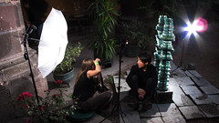 You can see the setup here, along with how far she was working over the ambient. The final photo had personality, room for the type and a very three-dimensional feel. Not bad for four days into a lighting career, huh?
Meanwhile, the Doofus Flails Away
So by Friday mid-afternoon we were done shooting for the week. Which was a good thing, because we had a presentation due at dinner and I had not exactly started on it yet. Oh, and a group shot of the class was needed, too.
Obviously, we have a bit of a standard to uphold here. I mean, the other concurrent class is led by David Alan Harvey, who has more talent in his beard stubble than I do in my entire generously shaped body. So we are definitely gonna light it. And I had just the place in mind -- a white-walled, underground tunnel on the hotel grounds.
I can already see the photo in my mind. Blasted, CTB'd (blue) light coming from the back, with hard, warm key light from the top. And hard fill pushing into people's faces from the bottom, too.
A little edgy and risky, just like the class. Should be no problem to knock out in 10 minutes, leaving a coupla hours to create a whole presentation. No sweat.
So I set up my lights and do a first test pop. Well on my way, I am sure. And then…
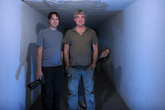 … um, well, that looks like crap.
 Not at all what I imagined. So much for previsualization. Thoughts of crash-and-burn start to creep into my mind. Because I can't really figure out how to fix it.
No worries. I'd like to think I can hit the occasional curve ball. We'll just bring the hard fill in a little tighter, to control the spill, and …
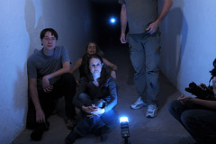 … well lookit that. A fresh, warm turd sitting right in the middle of the living room.
Okay, now I'm worried.
The lighting geek in me knows exactly the problem -- and it is solutions that are in short supply.
Problem: We are essentially standing inside a small, white-walled soft box. (Okay, a long strip box to be exact.) There ain't no gobo'ing and controlling light in here right now. And there ain't gonna be, either.
Calm-blue-ocean, calm-blue-ocean -- you still got 5 minutes, Slick. Maybe we can do something out in the sun…
No. I wanted the tunnel and we are gonna do the tunnel. (And try not to let the class smell the fear, okay?.)
So, forget the controlled light idea. Not gonna work. Change horses and go back to square one. Maybe we blast the backlight and embrace the inside-the-soft-box idea. Try it with just an overexposed backlight…
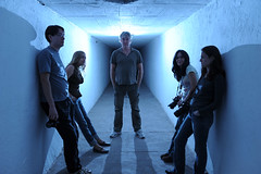 … Bingo.
Not what I originally envisioned, but now I got something I can work with here. Only we are already well into overtime. So we'll go quick and dirty.
Rather than just go with the blue dark-field lighting I am already seeing, I want to tone it down a bit and light the faces with some warm frontal light from a visible source. And rather than play around with fine-tuning the gels for 10 minutes, I am gonna save some time by cheating.
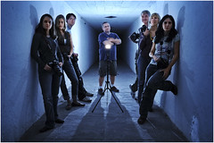 So here's the final (with Nerissa from SFW pushing the button) and it is not at all what it seems. I toned down the backlight and added some key from the in-the-frame light source. But you already knew that. Then we did the warm vs. cool thing after-the-fact, for brevity's sake.
 And very poorly, too, I might add. 'Cause at this point, we were rushin' it.
A Little Post Work
So, toned-down blue background. A little low key without a gel. How to warm it up?
Two copies of the same photo, in layers. Cool on top for environment, warm on bottom for flesh tones. Just erase the faces and skin to get to the warm tones underneath.
It was a sloppy job -- about two minutes with only fingers and a trackpad and it was headed to the slideshow. I left it rough, just like we did it, on principle. And compared to the first test shots, I was pretty darn relieved.
__________
A little note to the people in the photo -- you rock. You are all lighting photographers now, and I expect some pretty kickass work from you in my email box over the next few months. Seriously.
And, Speaking of Warm Flesh Tones
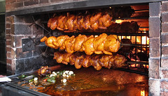 Peter D. and I had a late lunch on our rooftop terrace the day before the workshop, and he turned me onto this little fire-roasted chicken joint right near the hotel.
Whole birds, with rolls, roasted veggies and salsa, were just 50 pesos. That's about $3.75, or about the cost of a ketchup packet in NYC. It's the best chicken I have ever had -- and I don't even know what is in second place.
I am drooling on the keyboard just thinking about it now.
So if you get to San Miguel, I have left you an annotated map for your mandatory chicken dinner -- and a nearby taco stand for good measure. In case the chicken is too expensive, the tacos are delicious and 50 cents each.
So you see, you won't be needing to use Françoise's kitchen anyway.
Không có nhận xét nào:
Đăng nhận xét