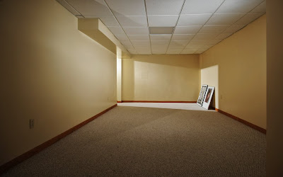
Greetings from The Cave, as my new (future) basement/office is known around the house. Today we are reporting back on BCII, #3, in which you were assigned to light and shoot a residential space of some kind.
Hit the jump for results, and one lucky winner . . .
__________
This Space Intentionally Left Blank
As you can tell, we're not real big on furniture yet in The Cave, but that'll change soon. I am roughing in what I want to do with it now, and will be hitting you guys up for creative ideas on how to handle the walls and other surfaces shortly.
I want to do something cool with it, and there are a lot of visual people who hang around the site. More on that in an upcoming post.
But I did want to shoot the empty end of the room (nary even a window) as an example that you can create shape and form with little more than some light and a big box. After all, this assignment was not so much about who could find the coolest room, but rather how you approached the space you chose.
Speaking of rooms, most everyone got the residential thing under control. Although some houses might have been best suited for The Addams Family. Others were damn close to a head shop feel.
Some people chose to go the detail shot route. And we even got the obligatory example of blatant pandering, natch.
Lots of kitchens were entered -- including some that were great examples of complex problem solving. But they were short on nuance, which admittedly is very difficult to pull out of a kitchen shot. But impressive balancing, nonetheless.
If the number of entries is any indicator, this third assignment in the progressively harder series kicked some of your butts. We had fewer than half the number of entries as compared to the other two assignments. (Wait'll you get to #4.)
On to the Short List
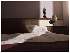 I liked the geometry of this frame, and the strobe through the door looked very much like natural light.
But I did want to crawl in there and turn the lamp on -- just burn it in with a little shutter for some glow and another layer ...
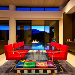 There was lots to love about this one, too: The intense color, the balanced light (ambient interior, strobe, sunset and fire) and the graphic lines in the composition.
On the downside, there was one thing I kept going back to. If you are going to go that geometrical, and have your lines that close to being straight, make an effort to square off the verticals and the horizontals. If you do not have a shift camera, you can always offset your shooting position to one side and crop to get the same effect.
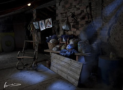 Lotsa cool things going on in here, too, where Lucas uses light against a dark palette to create a moody still life out of a dim corner in a room.
Click through for setup pics, which he kindly included.
(Many thanks for that, Lucas!)
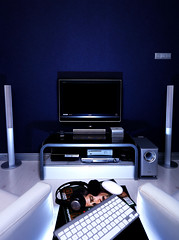 This picture was certainly harder than it looks, and was built on a bounced flash to create the floor to the exposure.
Again, if you are gonna be that close, try like heck to get those verticals vertical. Since it is built on flash, a stretch here might be to put something on the TV screen and burn it in with an ambient exposure.
 This living room from Thailand also went for the graphic look, with the composition creating layers of nested squares and rectangles. They took great care to dress both the vertical and horizontal lines, which added to the impact of the design.
Also, in the less-is-more department, this room is largely an ambient light shot. The overheads were softened with tissue paper to smooth them out a little, tho.
The lone, snooted flash details the Buddha busts, which appear to be getting some top ambient, too. Food for thought: You can sometimes accomplish more by going with the ambient flow, and using your flash to tweak problem areas. This photo is a great example of that.
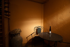 This photo could very well be ambient-only, as Kevin sells the balance between the fill and the defining shaft of light very well.
 But in fact, it is completely lit by flash. The "ambient fill" is a second strobe bounced off of the ceiling, several stops down. (The shaft of light is courtesy a 6" DIY snoot.)
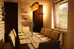 I like form revealed by the exterior flash shot through the blinds. And it is busy enough so where the keystoned vertical on the right is not very distracting, either. (You can get away with a lot when you have so many things going on in your photo.)
I also like the snooted spot, calling attention to the back of the frame, although I would have dropped it a stop or two. If that is taken down to where it is so subtle it is almost not there, it starts to look pretty slick.
 Last but not least, a photo which engages in the sincerest form of flattery. What Daniel lacks in abject originality, he more than makes up for in execution -- the flowers in the monochrome setting make the photo.
 Nicely done.
And much better than mine, to be honest.
__________
And the Winner Is . . .
This assignment probably surprised some of you by being deceptively difficult. It can be hard to balance windows, incandescents and flash. Let alone an CFLs thrown in there. But at least the subjects weren't moving, right? And your significant other probably got a clean room out of the deal.
Frankly, it's a pick 'em on any of these -- and several others, in the comments of which I left little notes. But who gets the multiple-flash (and boom) Strobist Kit, the lighting DVDs and the Trade Secret cards?
Click here to find out...
Không có nhận xét nào:
Đăng nhận xét