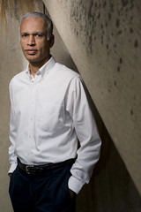
 One of the joys of being a photographer is the opportunity to spend your life intersecting with a steady stream of very interesting people. One such recent encounter was with author Manil Suri (The Death of Vishnu and The Age of Shiva), who I photographed for a literary magazine.
I never seem to have enough time these days to indulge in reading much fiction, but my wife is a big fan of Suri. My interest in him was primarily because of his alter ego as a mathematics professor at the nearby University of Maryland Baltimore County.
You don't run across too many people who can explain, in depth, the concept of infinity and crank out bestselling novels between classes.
Abstract Concrete, Redux
After a series of emails, we worked out that I would be able to photograph Suri in or near his office at the UMBC campus, before his midday class.
We would not get a lot of time, but that is part of the game (and, to me, a lot of the fun) when doing a magazine portrait. It is rather like the difference between playing a leisurely game of chess and playing a game under the gun with a timer.
An appropriate analogy in this case, because UMBC is a Big Dawg when it comes to intercollegiate chess. They delight in trapping the kings of players from schools where students pay three times UMBC's tuition.
Scouting within a small radius from Suri's office, I found an area behind his building where a weathered slab of concrete would make for an interesting background. Nearby was an indoor alcove where I could get a completely look, but I'll just be writing about the outdoor stuff to keep this post from turning into War and Peace.
In an earlier post entitled Abstract Concrete, I photographed a scientist who studies concrete at a molecular level. But for Suri, I just wanted to use the concrete wall itself as a starting point for a background.
I liked the patterns, but the tone was both too light and a little too homogenous -- both of which problems are easily solvable with a single speedlight.
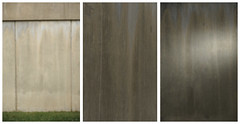 Looking at this three-pic composite of the background, you can see the original (auto) exposure on the concrete as it appeared as I found it. It's just a quick grab shot, not even in focus. But it doesn't need to be in focus, as it will be my backdrop and I want to get a look at it a little out of focus anyway. The tone is maybe a stop above medium grey.
In the middle frame, you can see the the adjusted tone after dropping the ambient exposure two stops and change. I liked this one better. It is also in focus, which to my taste makes it less interesting (and more competitive with the subject) as a background.
For the third frame, I took it back out of focus (by focusing to the point in front where I would have Suri standing) and threw a little snooted flash onto it at a hard angle from camera right. The flash was about a foot or two from the wall, raking across, and fitted with a Honl shorty (5") snoot. I put the silver side on the inside to soften the transition from light to dark.
How much strobe you hit it with is purely a matter of personal taste. To me, this dropped-and-flashed background is more interesting than the plain, light grey wall I started out with. That random splash of light adds a little interest, and I can position it for nice shadow-side separation, if needed.
I frequently use this process to build up my backgrounds as a more interesting second layer to a photo. When looking for a backdrop, always realize that you can take your found surface down via the ambient component of the full exposure. Or you can bring it up with a little background flash. Or you can have it both ways, as we did here.
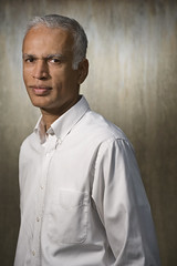 Enter Manil Suri. I used two SB-800s, each with LumiQuest SB-III modifier, for the key and the fill. The key light has a 1/8 CTO on it for a little warmth, and is about 5 feet from the subject at camera left.
At this distance the light is neither hard nor soft, which is a look that I like except you need to watch the shadow depth. And that depth can easily be controlled by altering the ambient exposure component.
But my ambient was being used to control the unlit portion of the background. So I would need to bring Suri's shadows up with a little fill. I chose to fill on-axis with a second SB-800 / Softbox-III, this one with no warming gel.
I could mount this flash on the hot shoe, although the SoftBox-III is a little big for that, and it would rotate with the vertical orientation of the camera. So I simply stuck it on a stand and shot from right under it. This way, you can get the bottom of the light right up against the lens barrel for more of an on-axis look to the fill.
The fill looked best at about 1 1/2 to 2 stops down, which kept the character of the hardish light without losing my shadow detail.
That one came off nice and quick. I liked it as a straight shot, but wanted to add another layer to it if I could do so without spending a lot of time. So I grabbed one of my favorite toys -- a Holga lens that has been mounted to a Nikon body cap.
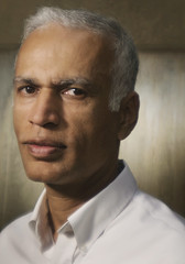 I love the airy, ethereal, Holga look when it is added to hard, sculpted light. The two balance each other out like lemon and sugar in a glass of lemonade.
(You may need to click the pic for a bigger version to see what the Holga lens is doing to this photo.)
There is almost no extra time required to swap out and get this extra look. And the irony of sticking a $50 piece of plastic on a $5,000 D3 (1:100 lens to body cost) is not wasted on me, either.
CORRECTION: Although for this particular shot the Holga was back on a D300 -- only 36 times the cost of the lens...
 This shot (seen at the top of this post and repeated here) was another quick add-on before going inside for the second setup. Just grab the key light and head over to under the exterior stairway to use it as a graphic element.
The process is very quick: Expose for the ambient, drop it 1 1/2 to two stops, bring in the warmed up key light (pretty close in this case) and adjust it's output until Suri has a good exposure.
The stairway and background vignette themselves because of the falloff of the nearby key light. Nothing complicated about it, but the stairs add a graphic element that gave me a second look before heading inside.
To Infinity, and Beyond
Suri really is an interesting guy. Not many people have that right brain / left brain thing going as well as he does.
If you want to see if you are capable of truly understanding infinity, take a look at his lecture on the subject, which was uploaded to YouTube.
If you plan on really trying to understand it, I would recommend two or three anticipatory aspirin, at the very least.
__________
NEXT: On Assignment -- Monteverde Institute
Không có nhận xét nào:
Đăng nhận xét